top of page

ANSON
Professional, sustainable, and trustworthy to represent PT. ANSON EMPAT SAUDARA, we decided to make a bold logo with Clean and Sleek appearance to the whole visual identity design.
Service
Identity & Branding
Client
Anson Group
Year
2020
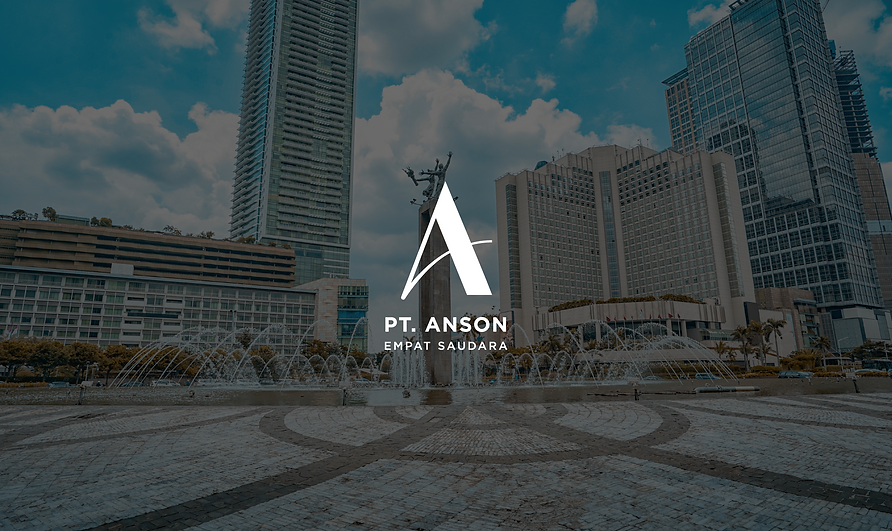
ANSON is a company that has been established for years. We want to create a new visual identity that represent the company itself with a
bold and professional style.
Combined with a clean application, with dark blue colour that symbolises loyalty, authority, and professionalism while the gold colour symbolises prosperity.


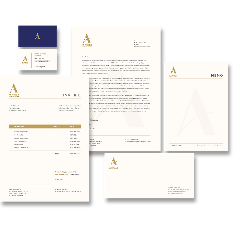
Stationary
The application of ANSON stationery.
It is the showcase of ANSON Branding Identity.


bottom of page